 Finding your Instagram niche can take a while, but once you find it, it’s important to stick to it.
Everyone has their own opinion of what makes an account beautiful, my favourite accounts vary from monotone and minimal to crazy kawaii accounts with loads of colour and sparkle.
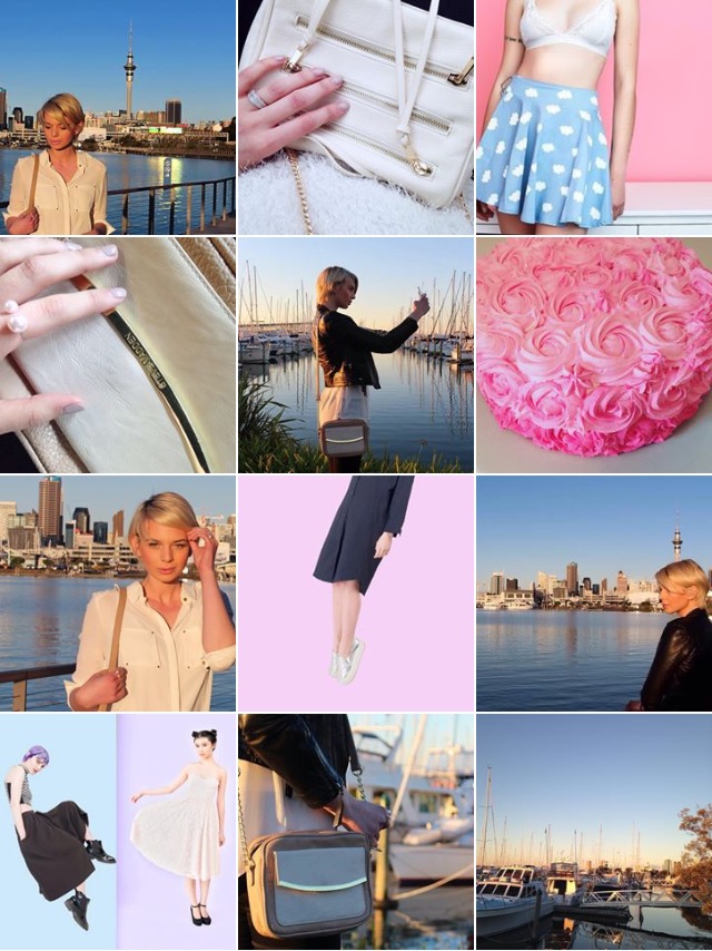
My own personal feed is quite different to the ones I adore. I like my feed filled with fashion posts, pastels and some scenic pictures in the mix too. It suits my style and my personality. I can be a bit of a fuss pot when it comes to what I have posted on my account.
These are my top tips for Instagram, from the apps that I use to colour choice and theme’s.
1. TAKING THE BEST POSSIBLE PHOTO’S
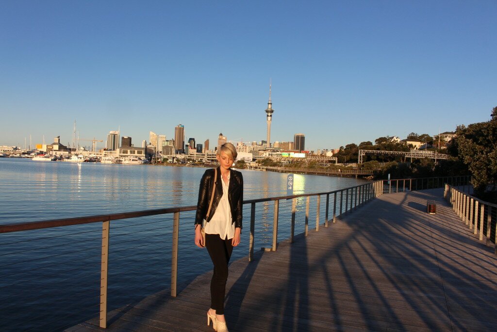
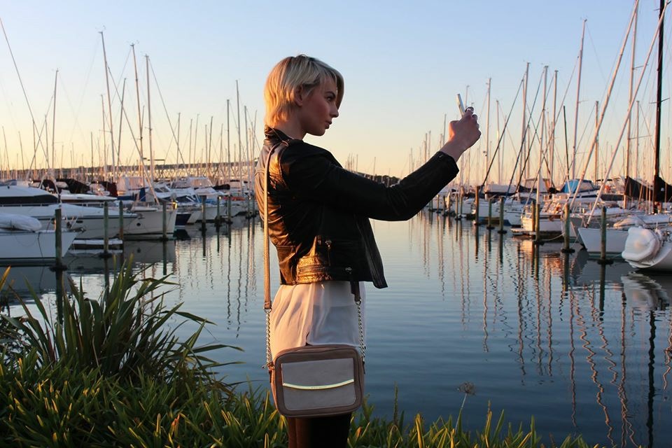
Don’t have a DSLR? That’s cool, the iPhone camera can take some amazing photo’s as long as you have the right lighting. One thing I have learnt the hard way, is it is all about lighting! Most of my Instagram images are taken with my DSLR but I like to break it up with some iPhone images too. If your taking photo’s outdoors, the best time of day is definitely sunset or “golden hour” (usually around 4-5 pm) The lighting is so pretty and most of the time you won’t need to edit them a lot because images tend to look warmer, brighter and have a more “finished” look.

Unedited image, taken at sunset. The image looks warm and doesn’t need a lot of editing.
 This was also taken at sunset, but the light had shifted a little. Still beautiful lighting, I really like the golden shimmer and the reflection on the water
2. EDITING APPS
I like to edit my photo’s even if they already look amazing. It’s just fun to play around with them and bring put the colours even more. My favorite editing apps rotate, but the two that I will never get rid of would be Photoshop Express and Aillis. Two quite different apps which I use for different things. I love Photoshop Express because I can adjust the noise in a photo. If you do take a photo in bad lighting, this app could actually save it, just by the “reduce noise” feature. Sure it’s better to get the lighting right in the first place but sometimes you don’t have much of a choice. This is my favorite feature on the app. After I have done that I will always punch the color out and brighten it up. I typically like bright photo’s with high color saturation, so Photoshop express is my go to.
Aillis, is my “beauty” app. It does it ALL. Brightening, skin clearing and color correction. If you want to go crazy- you can actually make your eyes bigger and face slimmer. It can get a little weird, but as long as you don’t go too crazy on it, it’s a great editor. You don’t want to go to overboard on the beauty apps, you start to look like a painting or a cartoon. It eventually becomes too artificial.
Going a little too crazy on Aillis, I played around with enlarging my lips and eyes and I look almost alien like. Fun to play with but definitely not realistic!
3. THEME
Sticking to a theme can be hard work. I struggle to stay within a theme because I like so many different types of images, plus I get a little bored overly themed accounts. I tend to just stick with girly colours and a girly aesthetic overall. This just gives me a lot more to play around with and allows my feed to demonstrate my personality. Your theme could be just as simple as a colour that reappears in your posts.

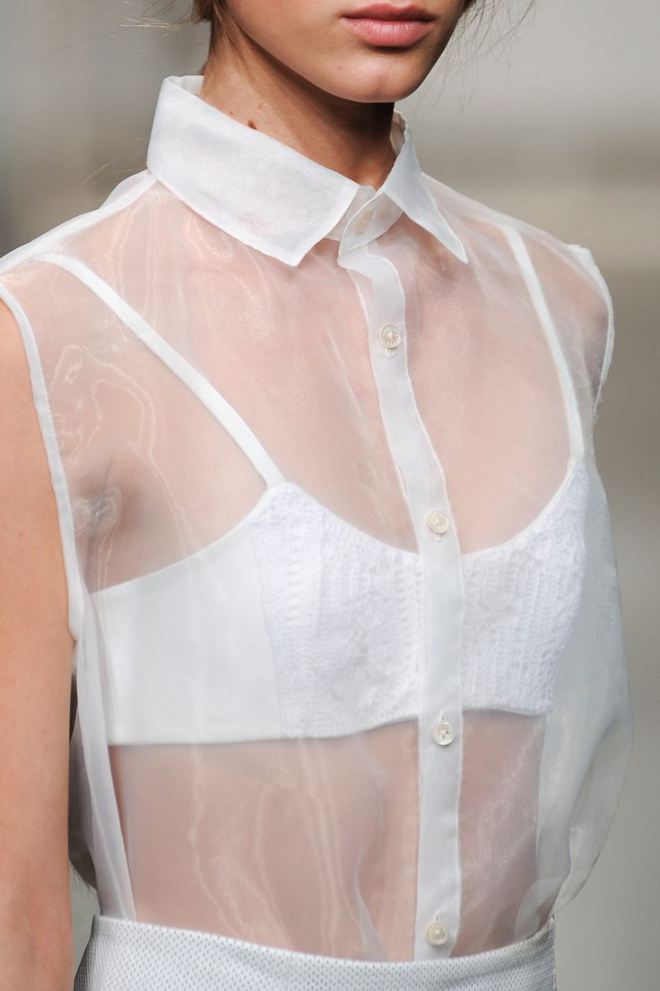
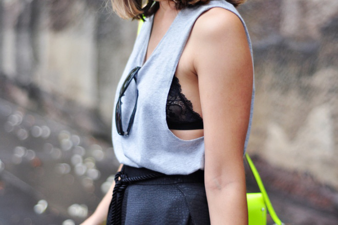
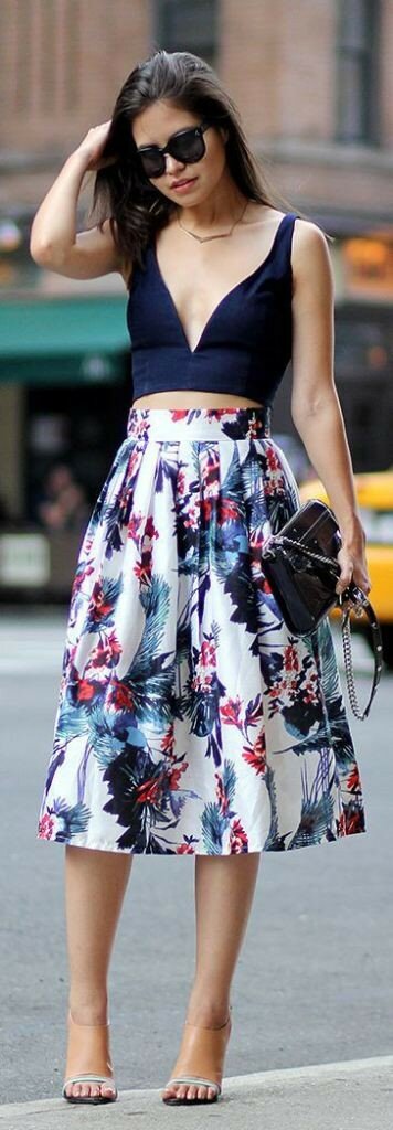
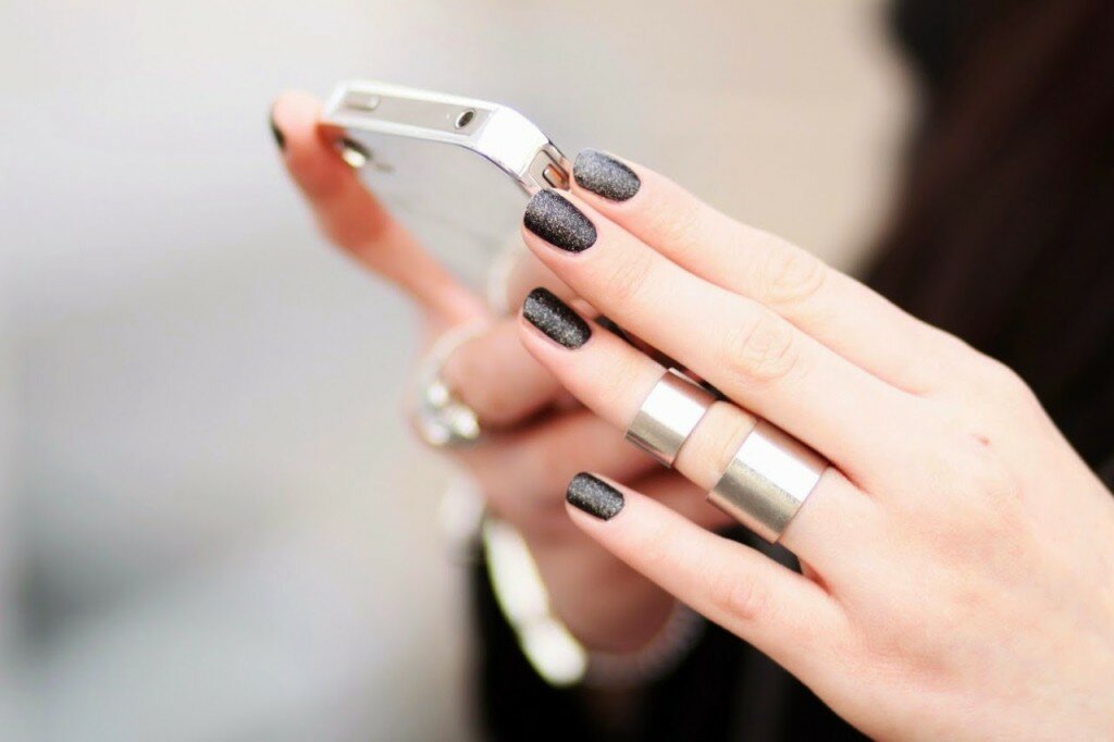
With my “theme” I like to break up my images by posting one photo of me (or someone else),then either a scenic pic or a photo of my new shoes or bag etc. This stops me from going too crazy with the fashion posts and not only keeps it more interesting, it reminds me to post with a little more variation. As you can see I tend to use a lot of pastel tones.
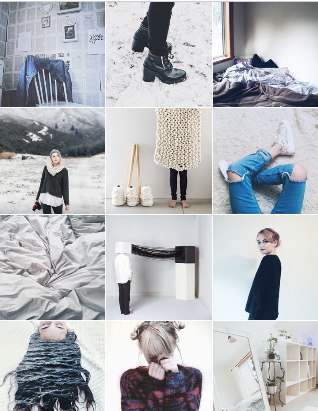
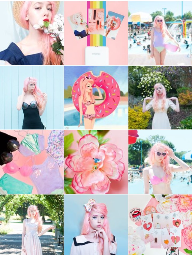
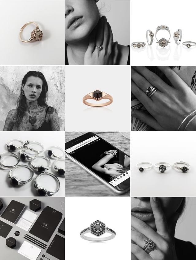
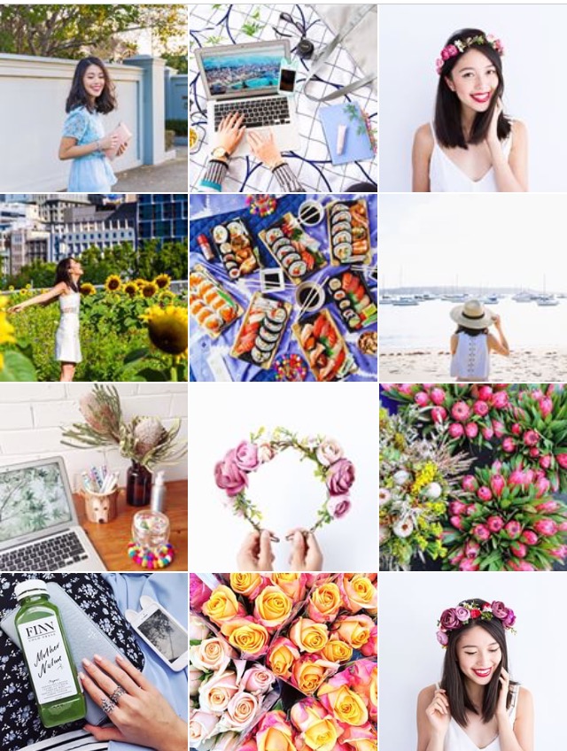
Some more examples of some great themed accounts that I follow,

account is a great example of beautiful lighting, well composed images and subtle glimpses into her life. I love the neutral tone of her feed and the compelling angles.

account is a pastel dream that perfectly matches her hair. The consistency in her images has kept me hooked, and the colours used in her feed are all perfectly in sync.
 I’m sure most of you have heard of . The theme of their account is the perfect example of breaking up textures and using monotones’ to their benefit. Beautiful and simplistic images, that create a well thought out account. Meadowlark have their Instagram theme down pat.

likes to have a lot of colour and florals on her account. I love the high saturation in her photo’s. Her account is the type that makes me happy to look at, every image is a whimsical story.
4. PLAYING WITH LAYOUTS
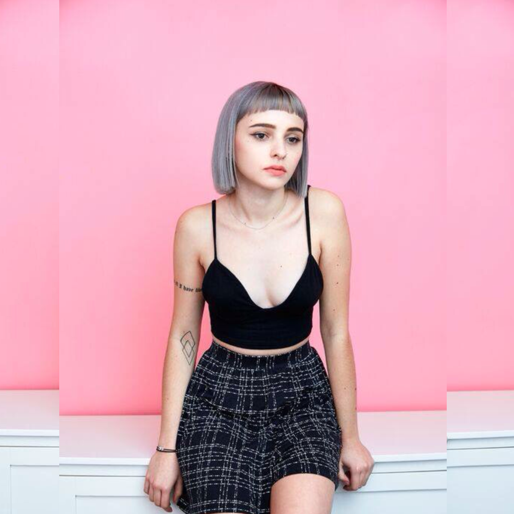
I’m not normally one for the mirrored look but at the same time I will never post an image to my Instagram unless it is square. Unfortunately, not all of my photo’s will fit into that perfect square box because of the narrowness of the image. So if I’m working with a portrait image and I’m unwilling to crop it, here is a little trick I tend to use. Using the app picsart, I will choose “Draw, then choose blank, then the size 2048 x 2048” This gives me a blank square image. I then pick 3 of the same photo to add to the blank background. Adjust the size accordingly and drag one photo to the left, then one to the right. Use the third image in the centre, and the back works as a well disguised background. I’ve done it really obvious for my example, but you can make it a lot more subtle.

So it all comes down to lighting, finding your theme, editing and placement. I hope you have taken something away from this post to help pick up your Instagram game and if I have missed anything out, leave me a comment below and I will try add it in to the post at some point! Happy snapping!
Liked this post? Follow me on
 HOMEMADE COFFEE SCRUB.

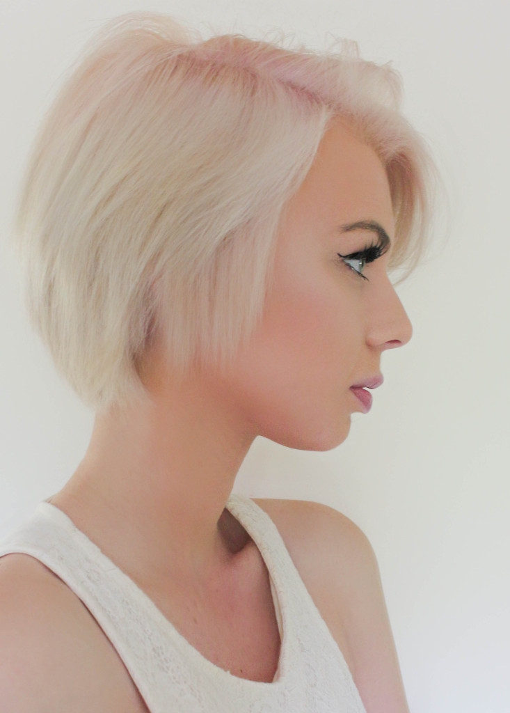
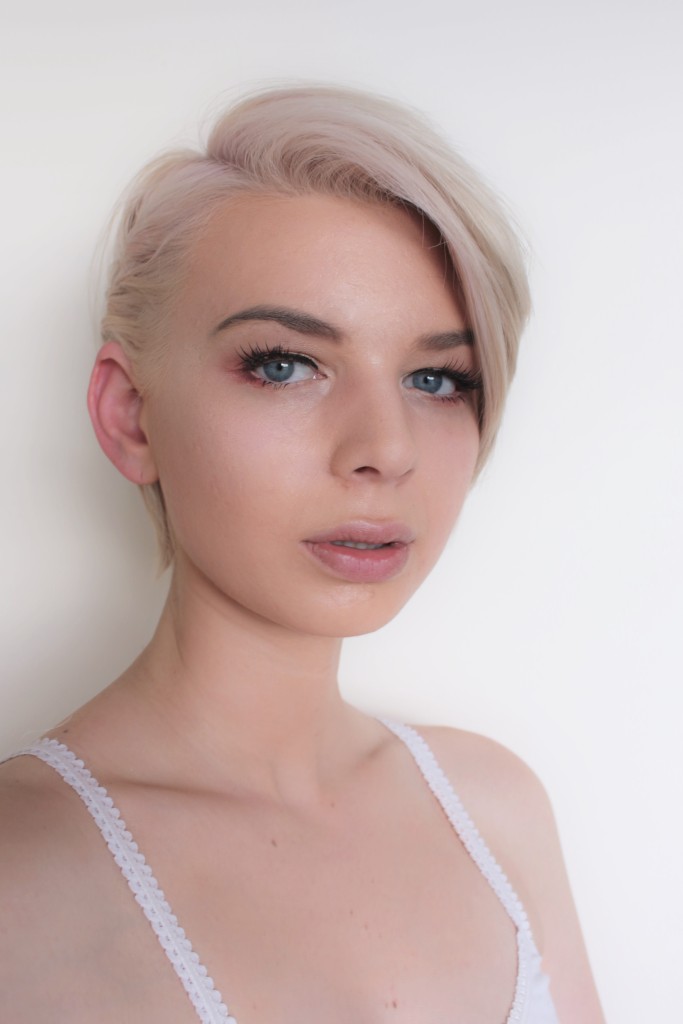
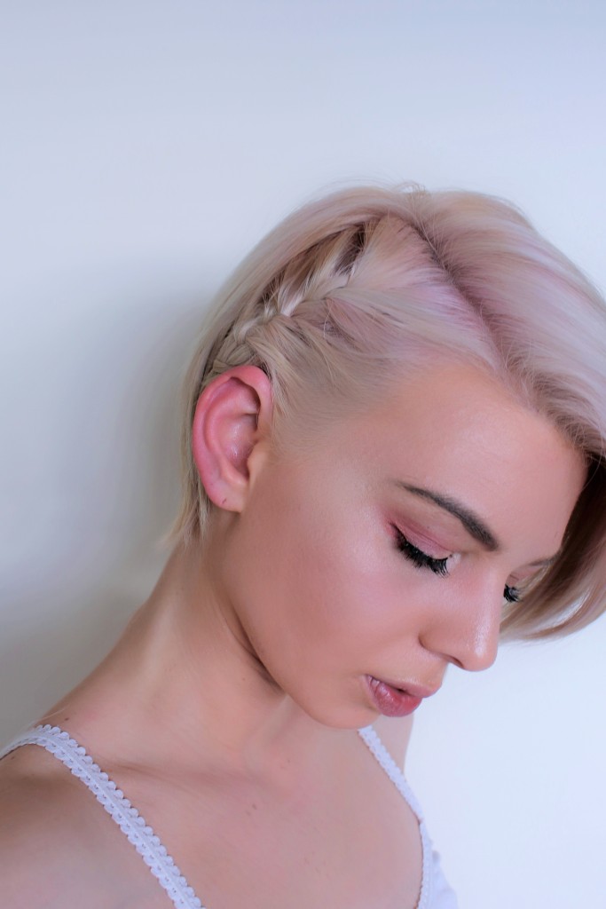
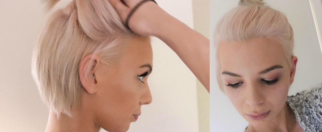
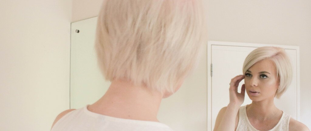 Finally tired of that cute pixie cut you’ve been rocking? Or maybe you finally decided to take the plunge and chop it all off only to realise your face shape does not suit your new do at all? Whatever the reason- Growing out a pixie is a long drawn out process and it tends to be a less than fun experience. Be prepared for the awkward bowlcut stage, the “too short to be a bob stage” and then the awkward flicks when you finally make it to shoulder length (by the time you make it to that stage you really won’t mind the flicks I’m sure)
 Finding your Instagram niche can take a while, but once you find it, it’s important to stick to it.